Unveiling the Power of Typography in Wedding Invitation Design
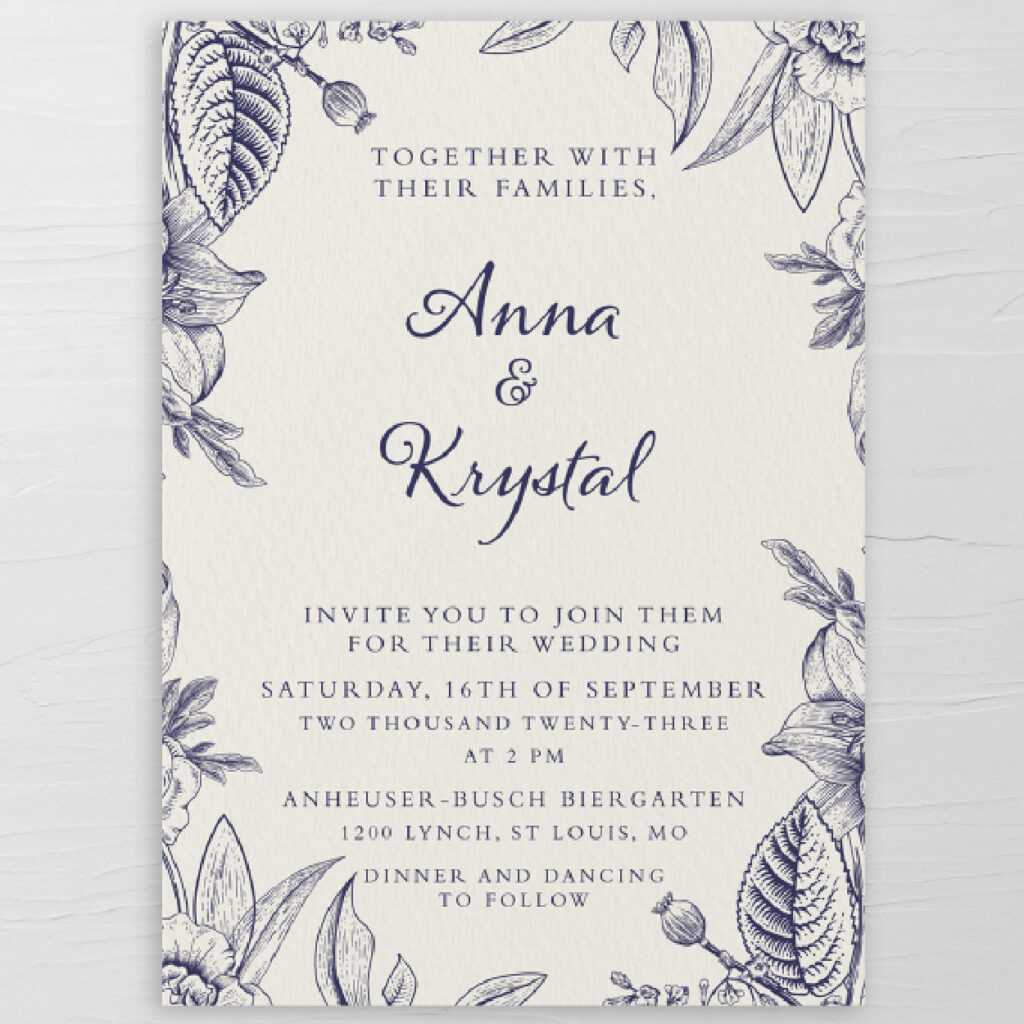
In the intricate tapestry of wedding invitation design, typography plays a pivotal role in setting the tone, style, and overall aesthetic of the celebration. The fonts you choose can evoke a sense of classic elegance, modern minimalism, or whimsical charm. Join me as we delve into the art of typography, exploring the impact of font choices and offering practical tips to help you decide on invitations that are not only visually appealing but also effortlessly readable.
Understanding Typography: Beyond the Basics
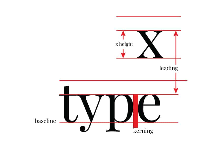
Typography is more than just selecting fonts; it’s about understanding the nuances of the look of a letter, spacing, and hierarchy. Before diving into font choices, consider the overall vibe you want your invitations to convey. Is it a formal affair, a casual celebration, or a whimsical gathering? Let the tone guide your typography decisions and help establish the theme.
Font Themes
1. Classic Elegance: Timeless Serifs
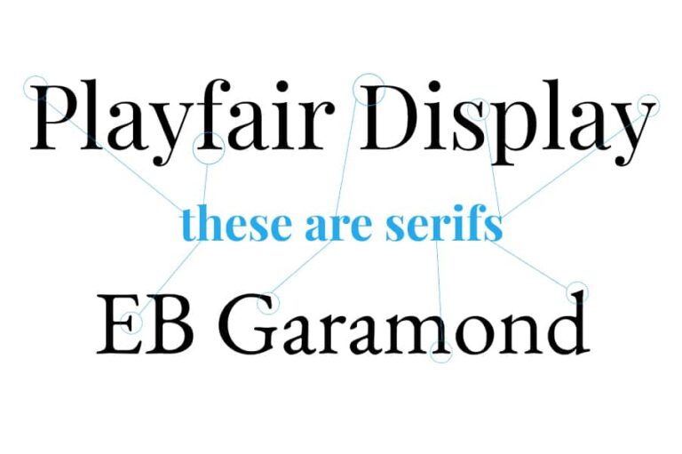
For an invitation that exudes timeless elegance, turn to classic serif fonts. Serifs are the small lines or flourishes at the ends of characters. Think of fonts like Playfair Display or Garamond. These convey sophistication and formality, making them ideal for traditional weddings.
2. Modern Minimalism: Sleek Sans-Serifs
3. Whimsical Charm: Playful Scripts
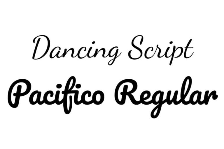
Capture the essence of whimsy and playfulness with script fonts. Scripts mimic handwriting and come in various styles, from elegant and formal to casual and carefree. Consider fonts like Dancing Script or Pacifico for a touch of personal charm in your invitations.
4. Artistic Flair: Decorative Fonts
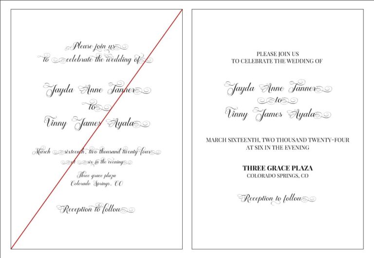
For couples with a creative flair, decorative fonts can add a unique touch to invitations. These fonts often feature intricate details, embellishments, or unconventional letterforms. Use decorative fonts sparingly and for specific design elements to avoid overwhelming the reader like Brignola Elegant Calligraphy.
Font Considerations
1. Balancing Act: Combining Fonts
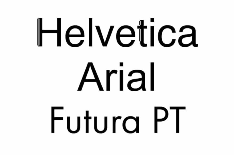
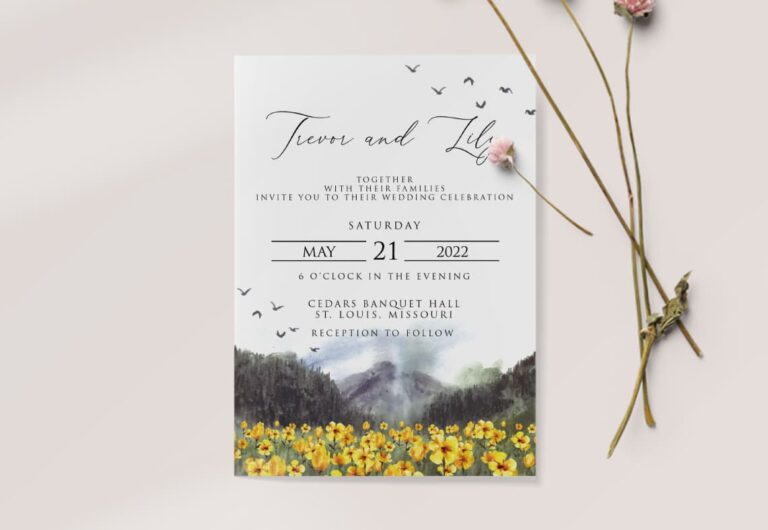
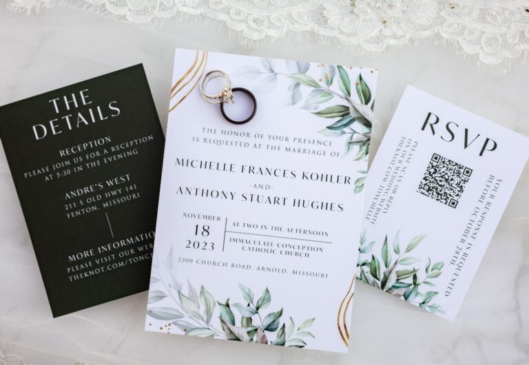
Choosing complementary fonts is a delicate balancing act. Aim for a harmonious pairing of fonts that creates visual interest without causing confusion. A common practice is combining a serif font with a sans-serif font or pairing a script font with a simple sans-serif for contrast.
2. Readability Matters: Size and Spacing
No matter how beautiful a font is, it must be readable. Pay attention to font size, especially for critical details like names, dates, and locations. Ensure there’s enough spacing between lines and characters for easy legibility. Partnering with an experienced designer like Chelsey Huff Design can ensure the layout is perfect.
3. Consistency is Key: Establishing Hierarchy
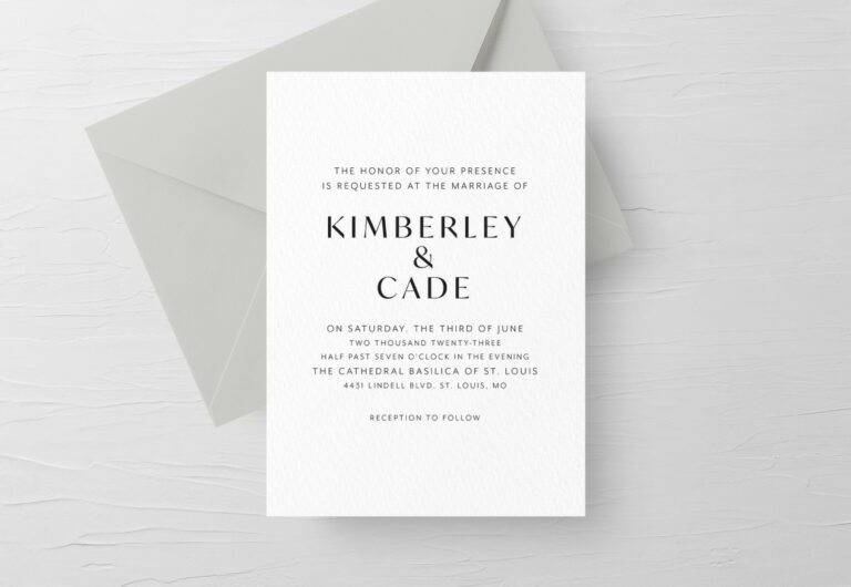
Establishing a hierarchy with your fonts helps guide the reader’s eye through the invitation. Use different font sizes, weights, or styles for headers, subheadings, and body text. Consistency in font choices creates a polished and cohesive look.
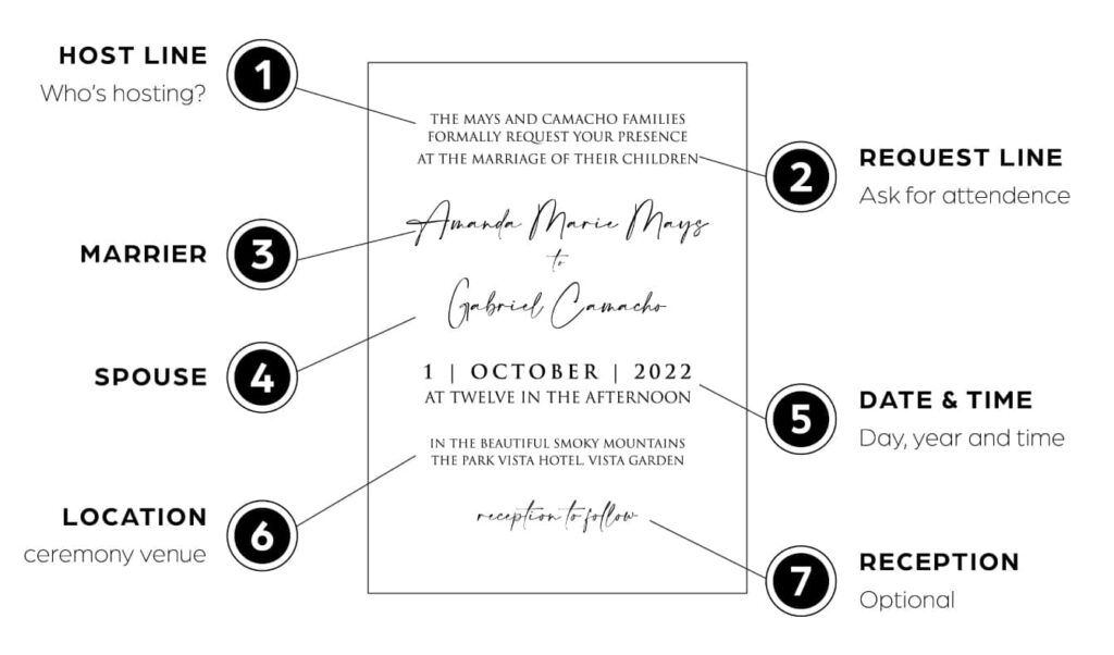
4. Test and Proof: Before the Final Print
Before committing to a particular font, test it on sample invitations and proofread diligently. Ensure that the font aligns with your vision, is legible in various sizes, and prints well on your chosen stationery. Don’t underestimate the power of a meticulous proofing process.
Personal Touch: Infusing Your Style
Remember that your wedding invitations are a reflection of your unique style. Infuse a personal touch by incorporating your favorite fonts or hand-lettering for a truly one-of-a-kind design. Consult with a professional stationery designer for bespoke font solutions that align with your vision.
Crafting Timeless Impressions
In the art of wedding invitation design, typography is the brushstroke that paints a picture of your celebration. Whether you opt for classic serifs, modern sans-serifs, playful scripts, or decorative fonts, let your typography choices speak to the essence of your love story. With a thoughtful approach to fonts, you can create invitations that not only invite but also captivate.
XOXO – Chelsey
